Reading the Forex Screen

How to speak the market’s visual language

Learn how to read Forex quotes, price charts, and indicators — the tools traders use to see what’s happening in the market.

ChatGPT Image Nov 12, 2025, 01_20_22 PM 1.png

The Screen That Never Sleeps 

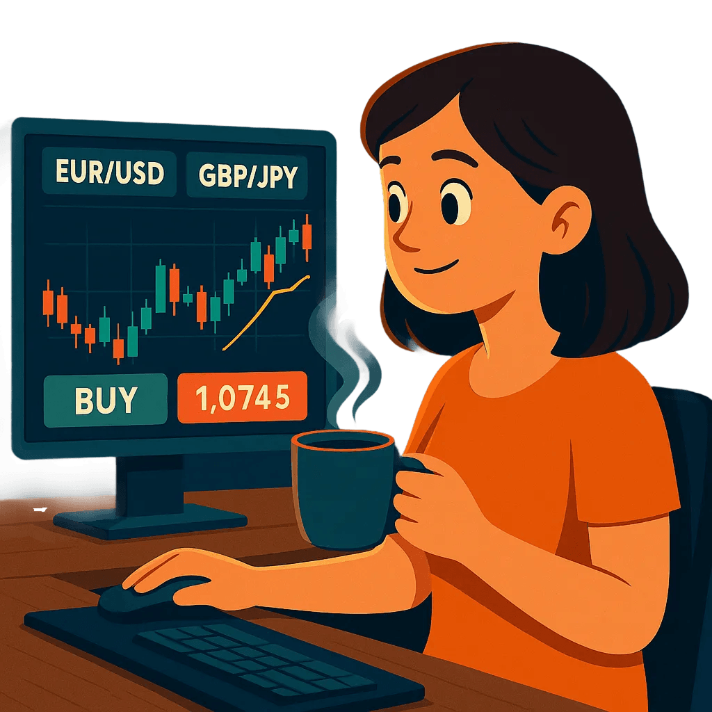
Anika is diving deeper into the world of currencies. Her morning coffee is brewing, and so is her curiosity.  

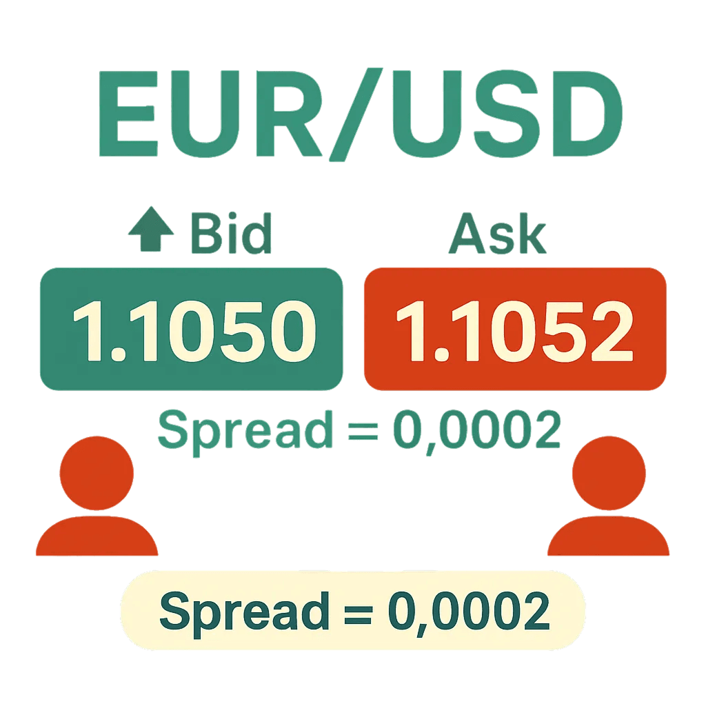
She logs into her demo trading app and sees rows of flashing numbers, green and red candles, and cryptic abbreviations. 

This looks like a cybersecurity dashboard,” she laughs. “Only instead of threats, it’s currencies fighting for dominance.” 

Every tick, every color, every candle tells a story. Today, Anika begins to learn the language of the Forex screen.

ChatGPT Image Nov 12, 2025, 01_25_35 PM 1.png

Understanding a Forex Quote 

Each currency pair is quoted with two prices: the bid and the ask.  

For example, take: EUR/USD = 1.1050 / 1.1052  

  • The bid is what buyers are willing to pay (1.1050).
  • The ask is what sellers would like to receive (1.1052)

The difference between the bid and the ask is called the spread (0.0002). That’s the broker’s small cut. 

A percentage in point (PIP) is the smallest price movement a currency pair can make, 0.0001 for most major pairs. 

Anika thinks:Tiny changes, big impact. One decimal in the wrong place can make a big difference.

The Pairs She Follows 

Anika bookmarks a few currency pairs on her app to watch daily, each offering a different perspective on the market: 

  • GBP/JPY: her favorite after her Japan trip, known for high volatility.
  • EUR/USD: the world’s most traded pair.
  • USD/CHF: includes Swiss franc, a common safe haven currency.
  • AUD/USD: includes Aussie dollar, tied to commodities and Asia-Pacific demand

By tracking them, she starts to spot how currencies move together and, sometimes, in opposite directions.

Candlestick Chart Comes Alive 

She switches to the candlestick chart view with red and green bars showing the price action. 

  • Green candle: price went up.
  • Red candle: price went down.
  • Long wicks: volatility — price swings before settling.

Each candle shows four key prices:  

  • Open: where the price started
  • Close: where it ended
  • High: the peak
  • Low: the dip

Candlesticks offer a visual read on market behavior: fast, slow, calm, or erratic. 

Anika discovers:These aren’t random shapes. They’re market sentiment visualized: fear, greed, confidence, doubt.

Timeframes Help with the Big Picture 

Her app lets her switch between timeframes: 

  • 1 to 5-minute charts show rapid, short-term movements — useful for spotting volatility, but often noisy.
  • Hourly charts help identify patterns or reversals developing over a trading session.
  • Daily or weekly charts reveal the broader trend, showing long-term support or resistance zones.

What looks like a downtrend on a 5-minute chart might be an uptrend on a 1-day chart. 

Anika notes:Perspective changes everything. Zoom in for detail, zoom out for context.”

Do you want to learn more?
Download InvestMentor to access the full lesson and explore interactive courses that build your financial knowledge and guide you toward smarter investing decisions.